A Serial Book Project @ CODEX 2024
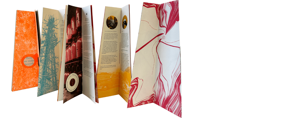
This year at the CODEX 2024, we showed six of our eventual twelve episodes of Arise By Any Other Name, a serial artists’ book.

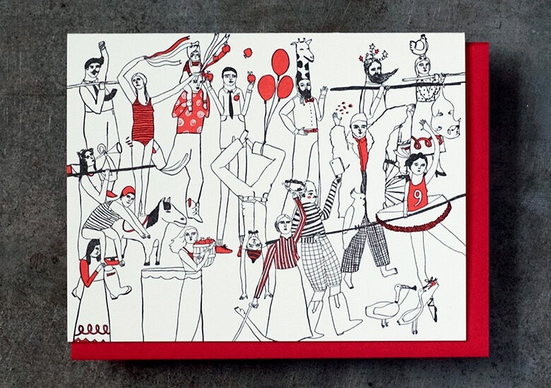
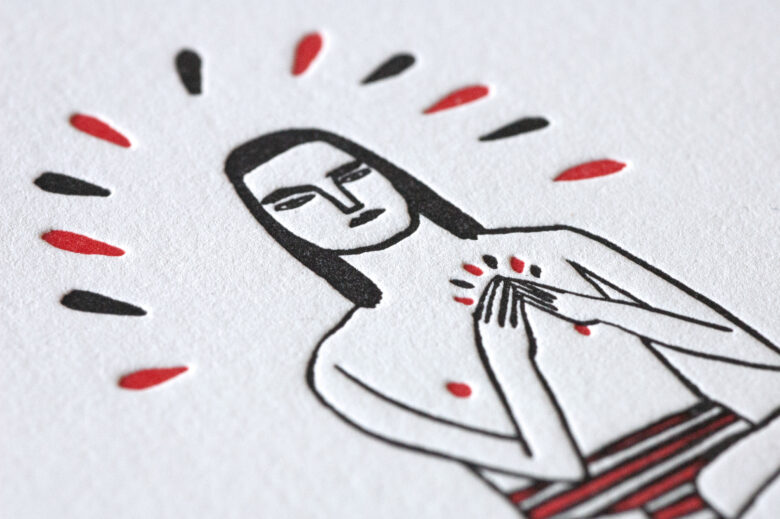
Swayspace + Kreh Mellick
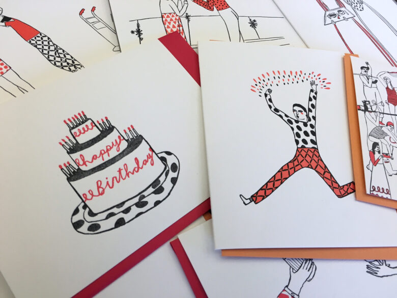
Introducing our new line of two-color letterpress cards, featuring the captivating illustrations of artist Kreh Mellick. They're available to order now!
Kreh’s whimsical illustrations create an intimate space for fun, earnestness, and creativity. The stories are right there on the front of the cards inviting everyone inside to celebrate and share. Send a card that is sure to please, with a message that comes from the heart. See the collection and read our interview with Kreh.
Lunchtable Links Aug 26, 2015
- Seeing Halloween costumes on Pinterest is reminding us of the holidays, when we get to be Back Home Ballers [YouTube]
- It's a rough day on the old internet, so take a minute and practice your self-care. We recommend these pictures of Drake smiling at things [Bustle]
- We talked the beef/misunderstanding between Jay-Z and Marina Abramovic and the strange symbiotic relationship between fine art and pop culture [Pitchfork]