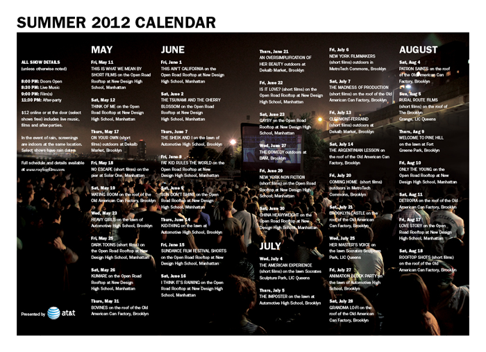
Shout It From the Rooftop!
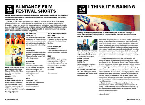
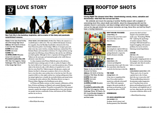
For the past six years, we have had the honor of designing the Summer Program Guide for Rooftop Films. Each year, we've kept the grid, layout and styles consistent. But this year we changed it up by making the guide much smaller.

We had to translate the same fonts and blocky, flexible grid system to a much smaller template. To allow more breathing room on our smaller pages, we cut the content on each program page down as much as possible. Keeping only the most necessary bits of information, meant giving more weight to what is most important and removing content clutter. And in order to give our smaller newsletter size pages as much visual punch as the big newspaper size we added color.


See you on the rooftop!