Utilizing Vintage Tech to Capture Movement and Abstraction
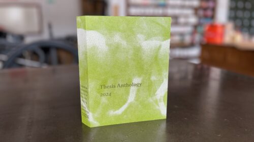
For over a decade, we have designed and letterpress-printed the book covers for the Columbia University School of the Arts/Writing Thesis Anthology. Our primary mandate is to create a design around the concept of something unfinished or in process.
This year we explored concepts around movement, inspired by the Muybridge horse, wind maps, Degas’s horses and horses, and Duchamp’s Nude Descending a Staircase, No 2.
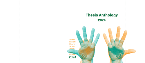
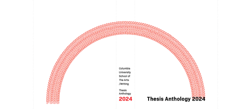
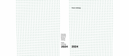
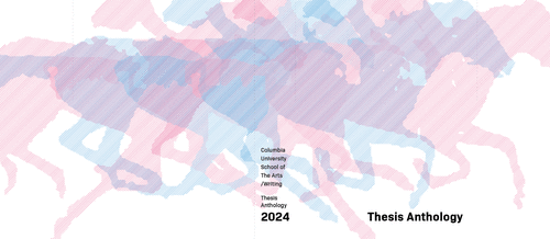
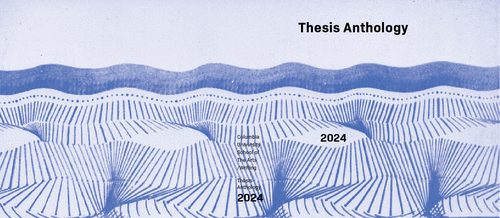
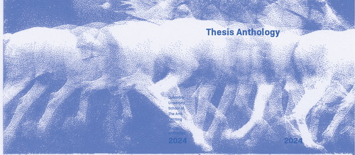
The students resoundingly preferred our design based off of Étienne-Jules Marey’s chronophotographic study, Cheval blanc monté, 1886, locomotion du cheval, expérience 4, Chronophotographie sur plaque fixe, négatif.
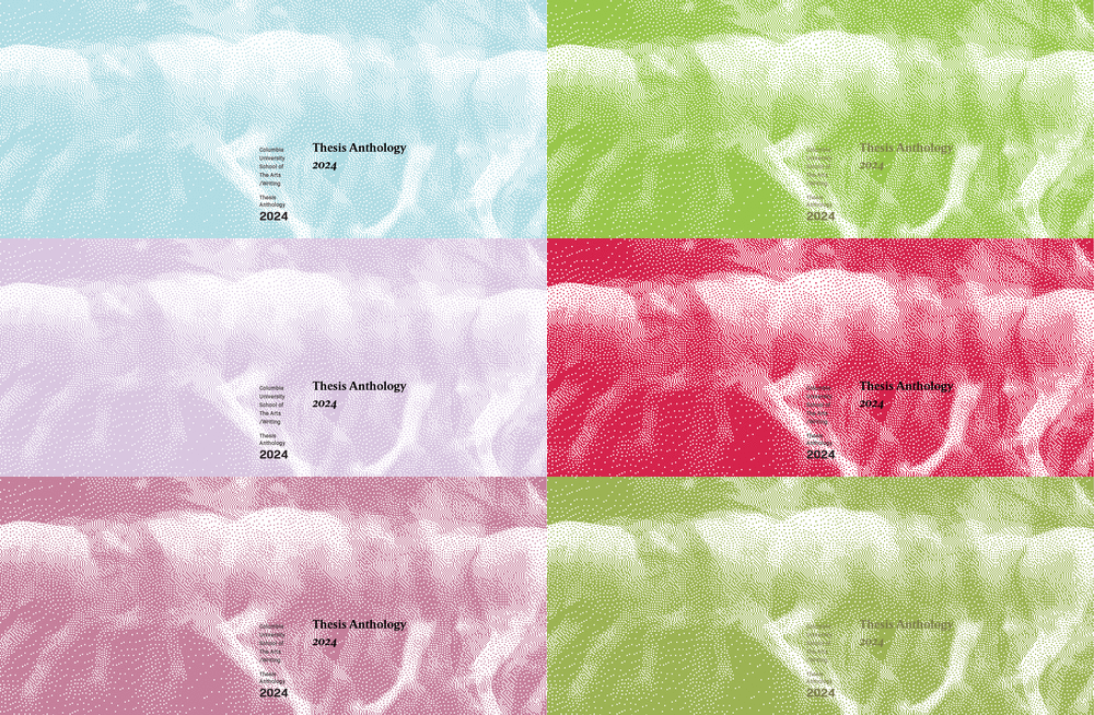
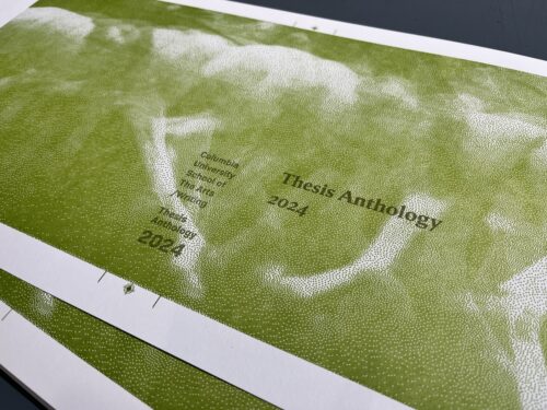
For our next round, we focused on how to render the image in a way that captured the feeling of being unfinished, pushed the design towards abstraction while maintaining the sense of motion, and took advantage of the letterpress printing process.
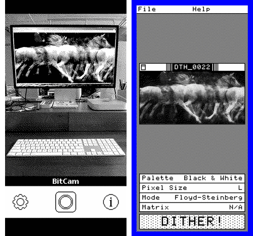
Creating the perfect dithered image in Photoshop often involves unending frustrating rounds of trial and error, so this time we turned to the delightful apps BitCam and Dither which harken back to the image processing on early Macs. In the end Dither proved more useful for this purpose because it let us import the already existing original.
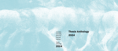
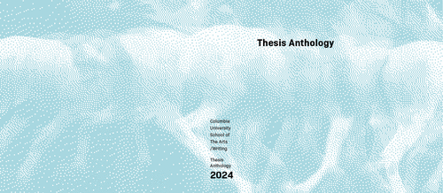
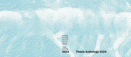
The students chose the smallest dither, which created a more photo-realistic finish. After locking down the typography, the last consideration was color. We showed a number of color schemes inspired by artwork and images the students had shared with us.
