Hadriano Stonecut Wins Battle Against Corrosion, Emerges as Head of Social Correspondence
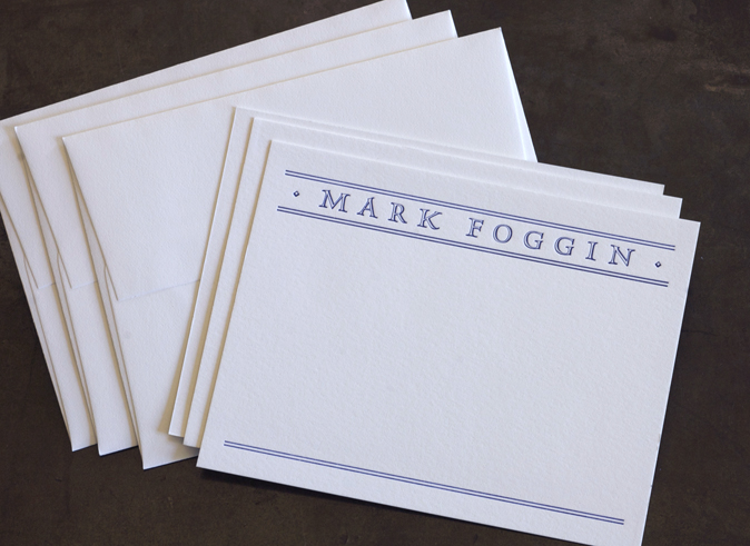
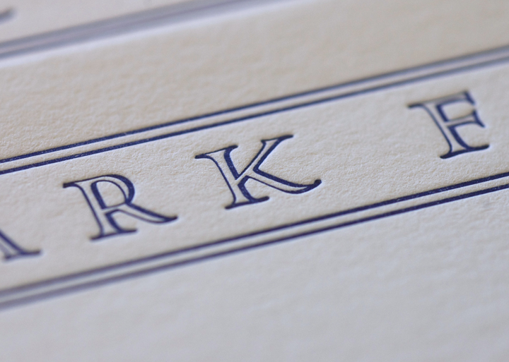
The cool composure of this distinguished and understated personal stationery belies its rough beginnings. The road to success was not paved with gold, but pitted and pocked by lead's greatest enemy, corrosion.
The story begins on the day our client and friend, Mark Foggin, entered our studio with this thank you note in hand.
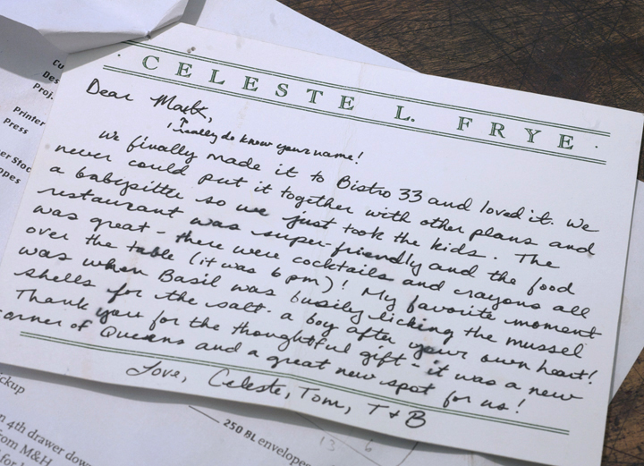
He wanted something very similar for himself, but with his name at the head and room below to write whatever he pleased. He liked almost everything about this card: the rule lines, the open typeface, the proportions and the flat presentation of the card.
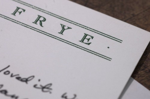
But instead of thermography, he was looking for a letterpress printed version. He wondered if we were capable of approximating the look and feel of the original design with the lead type and rule we have in our collection.
Challenge accepted!
The first face to come to mind was Hadriano Stonecut, a derivative of Goudy's Hadriano that we have in 24 pt and 30 pt lead.
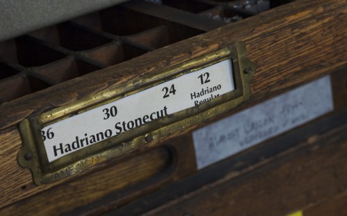
But when we pulled the drawer out, we saw that our face was under attack! Our Hadriano was writhing silently under the oppressive hand of corrosion.
Luckily, Mark was in no great hurry for his cards, and we were able to rush our type into an emergency anti-corrosion bath.
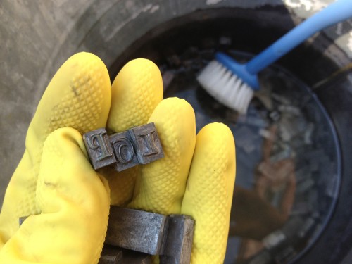
The bath begins with a 2-week soak in white vinegar, followed by an overnight immersion in dish detergent, followed by a 24 hour mineral spirit spa treatment. We weren't sure how deeply corrosion's teeth had cut, but we were hopeful for a complete rehabilitation.
The final scrub-down complete, we returned the Hadriano to its case, began laying out the card, and hoped for the best.
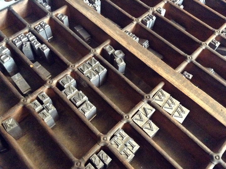
We matched the kerning and original details of the card, substituting a Hadriano punctuation mark for the small bullets that flank the name on the original card.
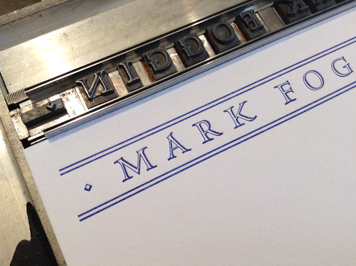
We were thrilled to discover that the Hadriano came out of lead ICU corrosion-free, with no visible lasting damage. The moment we pulled the first proof, we knew the Hadriano would emerge victorious.
After a lot of fussing with the kerning and the line spacing, we placed the punctuation.
In their new roles as ornament, the periods had to be turned sideways. But the periods are not symmetrical, and as we wanted the heavier line weight to fall to the bottom on both sides, we were constrained in our placement; the marks could only be as close to Mark's name as the type body would allow.
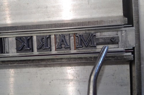
Spacing material was used to create the same distance from the type on the other side.
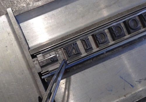
Let the bullet fall where it may...
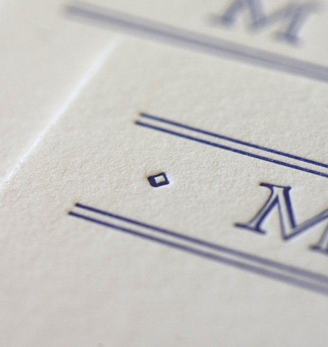
The Hadriano was already slipping into its new role as distinguished Head of Social Correspondence with ease. After perfecting the kerning and line spacing, it was time to tighten up the rule lines.
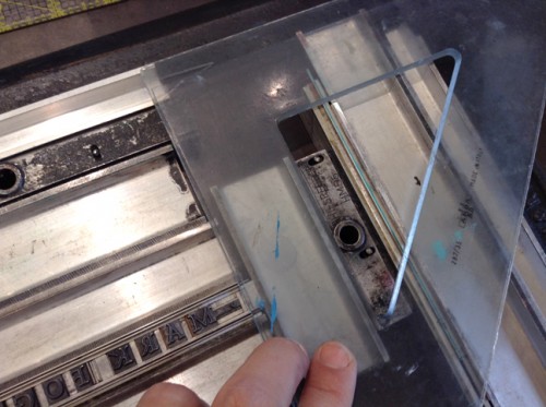
Although pressure is applied to the rule along the vertical axis, there is nothing to keep the rule from falling out of alignment horizontally.
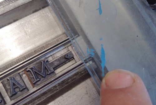
The rule is jogged up against a triangle and centered from left to right before the final lockup. Now the rule lines up, and supports the Hadriano, which can now step out with confidence, the full weight of its hard-won authority behind it.
