Declassified: the Great Gowanus Letterpress Paper and Ink Challenge, Part I
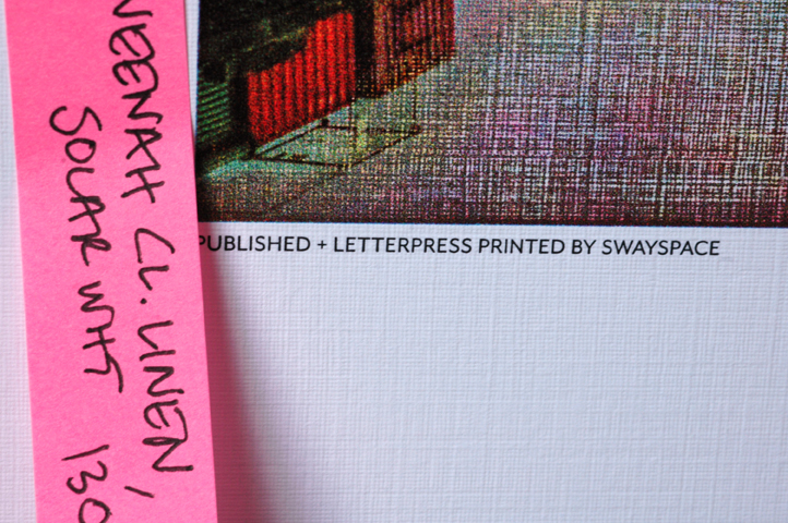
In our original translation of David Biskup's photograph of the Gowanus Canal (see our
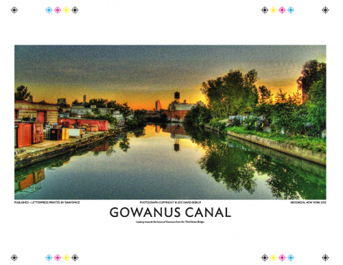
The original digital file
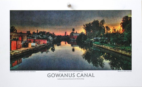
Letterpress print on Mohawk Superfine 260# DTC
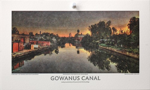
- Letterpress print on Hahnemühle Copperplate Bright White 600 gsm
The Mohawk Superfine's smooth, hard, commercial surface and Copperplate's softer, toothier aspect accounted for the some of the variability of how the ink lay down. The physical composition of the inks was another factor. We began to wonder: if we had a panoply of papers at our disposal– representing a diversity of surface textures, weights and densities– would we get any closer to a perfect print? But then how might we prevent the muddying of the inks?
Someone pointed to the ink shelf.
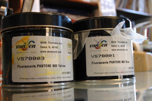
That's right, fluorescents. The Great Gowanus Letterpress Paper and Ink Challenge was on its marks.
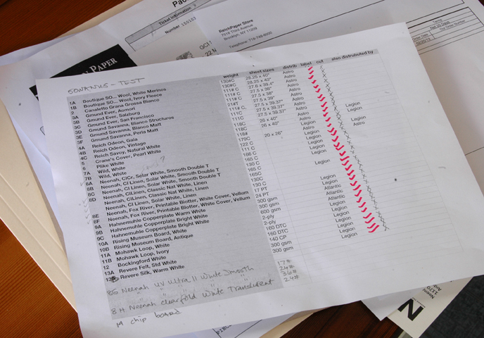
We gathered samples exotic and mundane: from Canaletta Grana Grossa to Neenah Blotter, from the elegant Revere Silk to the schmarmy Plike. All are equal under the blade of the guillotine. Once chopped and stacked according to weight, each sheet was run through the press; incremental packing was added as the sheets got thinner.
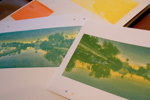
Working to match the letterpress to the digital print
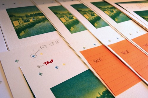
Making note of printing variations...
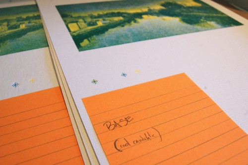
... and logging opinions
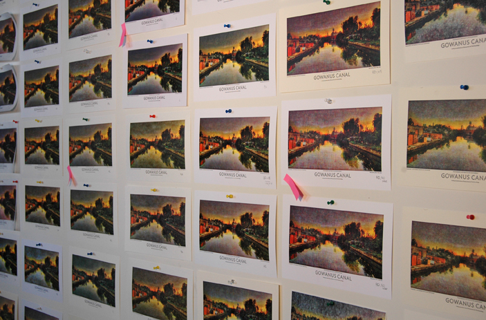
Great Wall of Print
Having flagged the most promising– or at least the most interesting– we've begun the process of evaluating the results. Stay tuned for Part II, where we reveal some of our findings. Let the anticipation be sweet torture.