Ed Rusha + craftspeople = kick ass
It sometimes seems like the contemporary art world is intent on spreading the word that hand work, craft & technique are not only beside the point of fine art, but actually stand in the way of it. Budding artists are often encouraged by their MFA'd mentors to either eschew the development of hand skill altogether or to look forward to employing assistants or craftspeople as executors or surrogates for their carefully nurtured concepts.
While artists like Warhol and Koons made themselves famous by advertising and celebrating their physical detachment from their work, others commission outside experts only when their ideas reach beyond the limits of their own native physical skills.
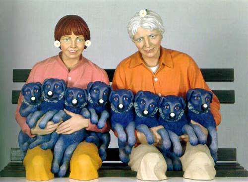
The artist Ed Rusha, who first gained art world cred in the 1960s his text paintings and artist books, combines high concept and high craft, hiring experts to take over when his projects demand it.

Check out the making of Ruscha's 2002 artist book, Me and The, produced at USF Graphicstudio in Florida. The team was challenged to innovate contemporary adaptations of the ancient tradition of fore-edge painting to complete Ruscha's book. Their attention to detail and the complexity of the process is pretty inspiring to watch.
Get Yer Sweetheart Cards Here!
Love is in the air, or at least the smell of ink and California Wash. Yes! We’ve been busy bees in recent weeks, designing and printing a fabulous collection of sweetheart cards.
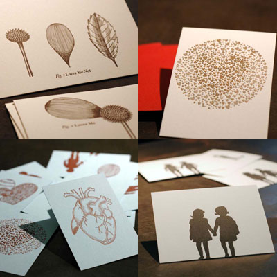
Varied in style and sentiment, there will be an occasion where one of these is going to work in your favor!
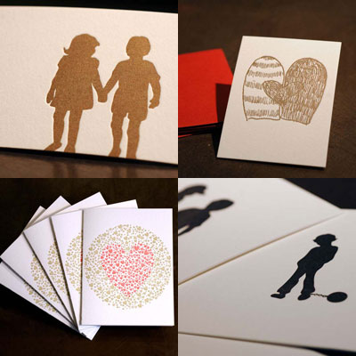
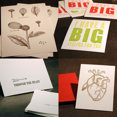
Guess where they’re being sold? Only in our BRAND SPANKING NEW STORE! Where you can buy ephemera for all manner of occasions, here look:
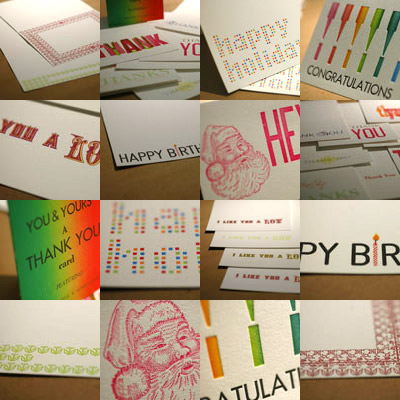
So there it is, check out the store and buy some cards for your loved ones, or not so loved ones.
When we print, we turn up the base
For years, we've been using the same bases here at Swayspace. We’ve always preferred the Bunting bases for the amount of truly specific control they allow us to correct and highlight certain areas of what are essentially photographic images. We have, however, also been limited by these bases. We have been using 2 bases that are 11 ¼” x 12 ½”, and 1 base that is 6 1/8” x 9 1/8” and on the one hand have played a tessellation game to create larger pieces than we would normally do for SP-20 and on the other have struggling to find a place for our guide pins on our C & P.
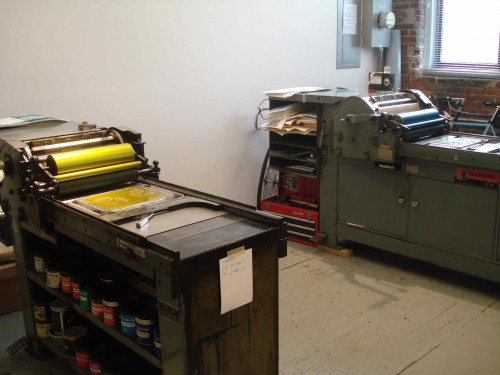
And though we put out many cool works, we still felt limited by the size. Well, no more! We figured it was time to hit the extremes and get the biggest base our Vandercook could handle and the smallest base we could get for the C & P.
We had already experimented with printing from larger than normal surface areas when we collaborated with Lite-Brite Neon We used a wood base that had the text carved into it. We then knew how big we could get, but we wanted to print big and perfectly. So we saved our nickels and dimes, turned in all our soda cans, and sold lemonade on the street to allow us to purchase a beautiful papa of a magnet, coming in at 18 ¼” x 24”
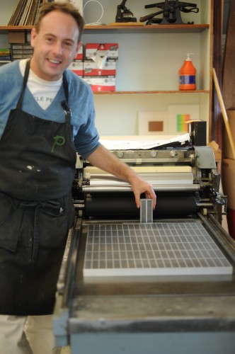
Practically filling the bed of the Vandercook, we can now put a plate anywhere we want! And more than that, we can finally print the posters and other large forms we’ve been dreaming of in our spare time. We felt that with our involvement with NYWI, now was the perfect time to explore just how far we could go with large form letterpress. Just having a base that size to play with opened up a whole new world of ideas for our designers, and we can’t wait to show you what we’ve come up with in the next few months.
We don’t want to belittle our little base, it is just as fantastic and ferocious despite it’s 2” x 4” stature. We often print envelopes or projects where the paper is cut to size on the C & P, and you can have a devil of a time trying to make sure your pins don’t hit your base. Remember the bunting bases are precise and delicate and can be smashed and mashed much like lead type. But now we’re going to retire our battle scarred base and replace it with our new Tiny Ajax! We’re finally going to have the flexibility to print almost anything we want almost anywhere. And it’s just so cute too.

Don’t think our old bases are going to waste though. We’ve put them on our recently refurbished SP-15 which we can’t wait to try out on some full wedding suites. The dream of having all the machines here running simultaneously is finally upon us. We’ve expanded our shop, we’ve hired more designers, we’ve found some great printers, and now our only limits are the limits of our imagination and the imaginations of our next generation of printers.

We're in a Show! New York Writes Itself
In June of this year, we were invited to participate in a letterpress show for a project called New York Writes Itself.
New York Writes Itself (NYWI) is an amorphous creative production where the inspiration is created not by one person, rather an entire city of potential scribes. Overheard conversations, glimpsed interactions or in-your-face encounters all form the ever growing script. A scribe is described by NYWI as “observational and in touch with the people of New York”, it can be ANYONE in short, and these recorded moments are simply submitted by logging on to the NYWI site and filling out a form.
The show we are in is called New York Types and is a celebration of NYC Letterpress community and the people of NYC. This particular chapter of the NYWI production serves as an ideal description of what NYWI is all about; the spoken word or observed daily life experience of a fellow New Yorker forming the impetus for creativity in whatever form it may take, in this case amazing letterpress posters.
Given the opportunity to be a part of this, we jumped at the chance to give life to the individual voices and views of the city and life in New York. Each Swayspacer created a poster based on selected scripts from NYWI and each designer put his/her own spin on the script creating what is an exciting and colorful addition to the show.

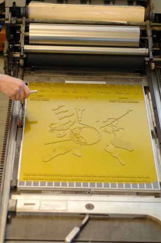
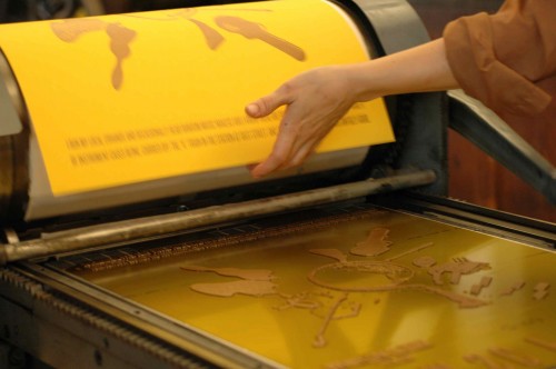
Here's Willy, crankin' out some posters:
In addition to the ten editions of posters, we also produced a large scale group poster to which we each contributed drawings.


You can see the full posters at the show, which opens Dec 15 at the Art Director's Club in New York. More info about the project is here, and you can RSVP for the event here. The pieces are also available for purchase on the NYWI website.
See you there!
Stop-n-Shop
@counternotions tweeted about a neat new advertising campaign designed by ad agency Cheil for Tesco Homeplus, a supermarket in Seoul, South Korea. Cheil created a large wall-length billboard resembling a virtual grocery store inside of a subway station. The ‘store shelves’ display images and prices of a range of common products. Each product has it’s own QR code which can be scanned to add it to an online shopping cart. After the commuting consumer is done shopping, the groceries will then be delivered to their home within the next couple of hours.
The objective of the virtual grocery store is to make productive use of commuters' waiting time by saving shoppers time spent going to the supermarket and, of course, advertising Tesco’s hypermarket which is currently under construction.
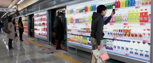
Because I have never lived in South Korea, I am not going to speak to how this product would succeed or fail in the context of South Korea. Because I do live in a city with the busiest metro system in the Western Hemisphere and an ever-growing, overworked labor force I am going to discuss this product in the context of my own home metropolis, New York City.
Like a real grocery store the aisles and shelves look bright, glossy, orderly...appealing. Such a cleanly rendered, realistic depiction of store aisles taken out their context and plunged into a space which is both hopeful (the ride home) and dreadful (the often hot, stinky wait) creates a tension which makes it feel almost like an art installation. And yet, in a space where commuters are preconditioned to be inundated with the ever-cycling advertisements of the day, I can't help but wonder if New Yorkers wouldn't just perceive this as an ad and thus be discouraged from actually interacting with it. Unless of course it was a product and an interface that the consumer was already comfortable using, such as Fresh Direct.
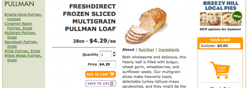
Fresh Direct is an online grocery store serving the New York City metrpolitan area. Shoppers order online and then FD delivers them at the customer's desired date and time. Here at Swayspace this is the service that we use to order groceries for lunches in the studio each week. For the first time last week I was in charge of putting in our order. Ordering packaged products like chips and cookies feels normal since these products look and taste the same almost every time I purchase them. Ordering cold cuts, fresh bread and ready-to-eat meals is a different story. A thumbnail image of Fresh Direct’s multigrain pullman loaf doesn’t say much to me when I can’t pick it up to feel it’s weight, density and color. These items arrived like a surprise as though someone else had more control over what arrived in our cardboard boxes than I did. The experience left me a little feeling uneasy. But as with anything, time and repetition would likely breed familiarity and I very well might look forward to tackling my Fresh Direct order while waiting for my ride home.
A few people responded to Tesco’s advertisement by suggesting that we take this model a step further to create whole stores with dynamic aisles of screens. This would allow product placement to be adjusted, sale items highlighted and prices managed from afar while taking up less physical real estate with the lack of aisle space needed for shopping carts and cashiers. Over time and generations could we slowly loose our attachments to the sensory inputs a grocery store: the smell of muffins from the bakery in the morning, the chill in the freezer aisles, the convenient candy bar on your way to checkout. In considering the possibilities of such an interface, the problems of substituting the usual sensory experiences of grocery shopping pose clear hurdles to designers trying to engage their users.
In a city where the urban working dwellers spend long hours in the office and usually can’t wait to get home to their young ones or out to the bar for a cold drink this just might work (that is if you can get used to getting shoved out of the way as you reach to scan the milk). For now, I’ll continue to cherish it when the butcher hands me a slice of turkey to test it’s thickness and when I press my finger into an avocado and know I’ll be able to eat it the next day.