Lunchtable links: Aug 5, 2015
We at Swayspace share a meal and lots of laughs at lunch. Here are some of the things we've shared today
- The beautiful photography of Cass Bird [Instagram]
- "Millennial men aren't the dads they thought they'd be" [NY Times]
- The tensile strength of leather pants (SFW edition) [The Guardian]
- Feeling at home in New York and elsewhere [The Atlantic]
- This very cool curated list of things in cities across the world, including a section on our home in Gowanus, by our friends at Hyperakt [On The Grid]
Come across something interesting today? Tweet at us @swayspace!
Verse vendors: Lego my Whitman
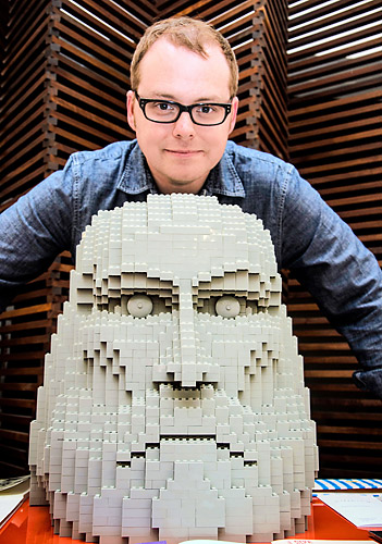
Our very own Jeff Peterson makes headlines with his Lego portrait head of Walt Whitman.
“There wasn’t a lot of planning, but there was a lot of micro-planning,” Peterson said. “Every moment became a new decision.”
Hadriano Stonecut Wins Battle Against Corrosion, Emerges as Head of Social Correspondence
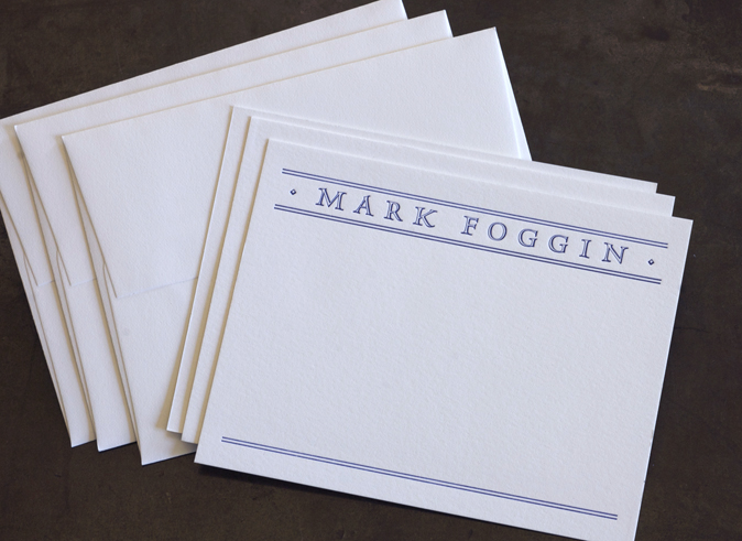
The cool composure of this distinguished and understated personal stationery belies its rough beginnings. The road to success was not paved with gold, but pitted and pocked by lead's greatest enemy, corrosion.
The story begins on the day our client and friend, Mark Foggin, entered our studio with this thank you note in hand.

He wanted something very similar for himself, but with his name at the head and room below to write whatever he pleased. He liked almost everything about this card: the rule lines, the open typeface, the proportions and the flat presentation of the card.

But instead of thermography, he was looking for a letterpress printed version. He wondered if we were capable of approximating the look and feel of the original design with the lead type and rule we have in our collection.
Challenge accepted!
The first face to come to mind was Hadriano Stonecut, a derivative of Goudy's Hadriano that we have in 24 pt and 30 pt lead.

But when we pulled the drawer out, we saw that our face was under attack! Our Hadriano was writhing silently under the oppressive hand of corrosion.
Luckily, Mark was in no great hurry for his cards, and we were able to rush our type into an emergency anti-corrosion bath.

The bath begins with a 2-week soak in white vinegar, followed by an overnight immersion in dish detergent, followed by a 24 hour mineral spirit spa treatment. We weren't sure how deeply corrosion's teeth had cut, but we were hopeful for a complete rehabilitation.
The final scrub-down complete, we returned the Hadriano to its case, began laying out the card, and hoped for the best.

We matched the kerning and original details of the card, substituting a Hadriano punctuation mark for the small bullets that flank the name on the original card.

We were thrilled to discover that the Hadriano came out of lead ICU corrosion-free, with no visible lasting damage. The moment we pulled the first proof, we knew the Hadriano would emerge victorious.
After a lot of fussing with the kerning and the line spacing, we placed the punctuation.
In their new roles as ornament, the periods had to be turned sideways. But the periods are not symmetrical, and as we wanted the heavier line weight to fall to the bottom on both sides, we were constrained in our placement; the marks could only be as close to Mark's name as the type body would allow.

Spacing material was used to create the same distance from the type on the other side.

Let the bullet fall where it may...

The Hadriano was already slipping into its new role as distinguished Head of Social Correspondence with ease. After perfecting the kerning and line spacing, it was time to tighten up the rule lines.

Although pressure is applied to the rule along the vertical axis, there is nothing to keep the rule from falling out of alignment horizontally.

The rule is jogged up against a triangle and centered from left to right before the final lockup. Now the rule lines up, and supports the Hadriano, which can now step out with confidence, the full weight of its hard-won authority behind it.

The Great Gowanus Letterpress Paper and Ink Challenge, Part II
The results are in! After testing dozens of weights and finishes, we finally found a paper with a good balance of tactility and smoothness. This paper worked well with the letterpress printing process, while bringing out the lyrical quality of David Biskup's gorgeous Gowanus photographs.
And the winner is....

We used the winning paper to execute this large format letterpress print, based on a photograph from David Biskup's Gowanus series.
REVERE SILK 300 gsm !
Although the toothier papers can be very satisfying, extreme texture affects the way the ink distributes on the surface of the paper. In some cases, artwork may benefit from this texture, which creates a "salty" (i.e., patchy) print. But in the case of Biskup's photographs, we felt that smoother was better.
But not too smooth!
Below is a sampling of the runners-up, from slickest to coarsest.
PLIKE 330 gsm
The Plike gave us an extremely slick, photographic look. So slick that we almost forgot it was a letterpress print. The surface felt more like plastic than paper; in a word, it lacked soul.


Plike detail 01

Plike detail 02
REICH SAVOY, 118#
Although the Reich has been a great option for business cards due to its relative stiffness and subtle texture, in the case of these photographs (printed by laying each layer of color on top of the next– Cyan, Magenta, Yellow and Black), the color became muddied and, frankly, a little gloomy.


Reich Savoy detail 01

Reich Savoy detail 02
CHIPBOARD
Although the detail shots make this option look pretty interesting, the overall effect was too dark, and the detail– particularly in the trees– was almost totally lost.


Chipboard detail 01

Chipboard detail 02
NEENAH CLASSIC LINEN, 165# DTC
More gorgeous details, but, again, the overall result was patchy and uneven. The canvas effect is nice, but after running the paper through the press 4 times, the texture of the paper was flattened in spots and so took the ink unevenly. And not in a good way.


Neenah detail 01

Neenah detail 02
GMUND EVER, Amori, 111# C
The GMUND Ever has what can only be described as a reptilian finish. The detail shots are totally lovely, but unfortunately, their quality doesn't translate when looking at these prints in real-world scale. Many areas are unreadable, and the sense of reflection in the water is totally lost. We're sure this paper could be used to make a really interesting print of some kind. Just not of this kind.


GMUND detail 01

GMUND detail 02
THE WINNER
REVERE SILK, 300 gsm
This paper walks a good line between slick and knobbly. It's smooth enough to hold the detail of a photograph, and soulful enough to give the print a special, tactile quality.


Revere Silk detail 01

Revere Silk detail 02
We were ready to do a second print. We selected this image, manipulating the digital files to ensure that we'd get a nice clear sky and sharp detail.

Shannon Miwa, our resident letterer, hand-drew the caption, which is printed in four colors

We're pretty happy with the tension between the photographic and the painterly in this print, and the way it manages to celebrate the confluence of the dirty and the dignified.


Although not yet available for purchase, one print will be available through silent auction this Saturday, June 15th at the Gowanus Challenge, a historic boat race between the Gowanus Dredgers and the Red Hook Boaters on your favorite radioactive canal!
Dapper Dads
Towards the end of last year, the studio was all abuzz about textiles and patterns. The qualities of fabric, yarn, and lace seemed to hold limitless possibilities for reinterpration through the textural medium of letterpress printing. We followed our curiosity, and came up with our holiday-sweater-inspired Holiday cards. We followed up with a variation on a theme for our Mother’s Day cards.
Our latest card, the Father’s Day Dapper Dad cards celebrating all the dashing and debonair fathers in our lives, represents our most recent iteration.

After some experimentation with the scanner, the camera, and some hand-drawn sketch work, we bid to stay away from the linearity of some vector illustrations by tracing a real shirt and tie, emphasizing the ticking in the shirt, the herringbone weave in the tie and the ebbs and flows of the contrasting patterns.

We printed the three colors that form the stripes of the tie first. We put in extra packing for the final plate, impressing deeply into the paper in order to mimic the textural qualities of the fabric itself. For the ghosted tie image on the back of the card, we made a conscious decision to minimize the punch– we wanted to leave your writing surface as smooth and well-groomed as the dad you adore.

You can order your Dapper Dad cards through our online store, or pick them up at Lion In the Sun in Park Slope, By Brooklyn in Carroll Gardens, and Sparrow Hair in Chicago.
Happy Father's Day, dapper dads.