
The Great Gowanus Letterpress Paper and Ink Challenge, Part II
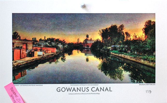
The results are in! After testing dozens of weights and finishes, we finally found a paper with a good balance of tactility and smoothness. This paper worked well with the letterpress printing process, while bringing out the lyrical quality of David Biskup's gorgeous Gowanus photographs.
And the winner is....
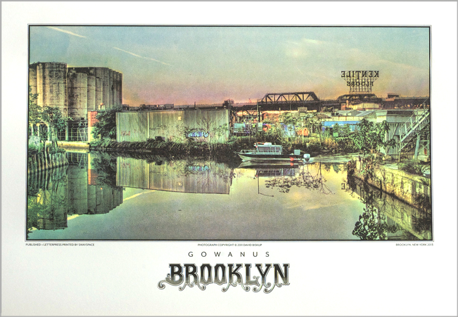
We used the winning paper to execute this large format letterpress print, based on a photograph from David Biskup's Gowanus series.
REVERE SILK 300 gsm !
Although the toothier papers can be very satisfying, extreme texture affects the way the ink distributes on the surface of the paper. In some cases, artwork may benefit from this texture, which creates a "salty" (i.e., patchy) print. But in the case of Biskup's photographs, we felt that smoother was better.
But not too smooth!
Below is a sampling of the runners-up, from slickest to coarsest.
PLIKE 330 gsm
The Plike gave us an extremely slick, photographic look. So slick that we almost forgot it was a letterpress print. The surface felt more like plastic than paper; in a word, it lacked soul.
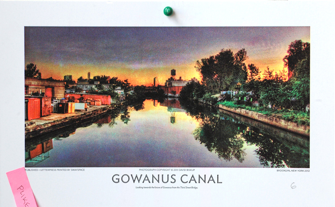
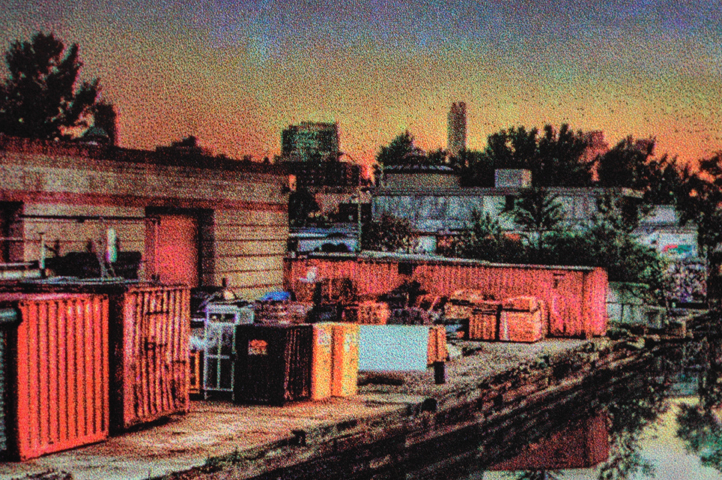
Plike detail 01
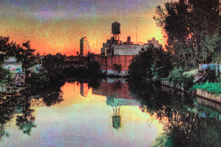
Plike detail 02
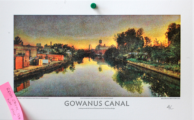
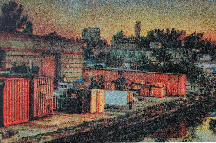
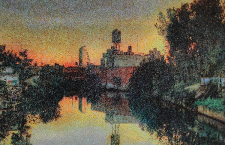
REICH SAVOY, 118#
Although the Reich has been a great option for business cards due to its relative stiffness and subtle texture, in the case of these photographs (printed by laying each layer of color on top of the next– Cyan, Magenta, Yellow and Black), the color became muddied and, frankly, a little gloomy.
Reich Savoy detail 01
Reich Savoy detail 02
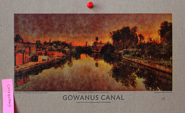
CHIPBOARD
Although the detail shots make this option look pretty interesting, the overall effect was too dark, and the detail– particularly in the trees– was almost totally lost.
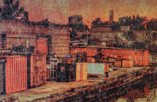
Chipboard detail 01
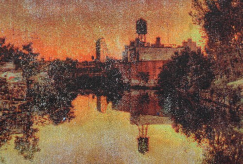
Chipboard detail 02
NEENAH CLASSIC LINEN, 165# DTC
More gorgeous details, but, again, the overall result was patchy and uneven. The canvas effect is nice, but after running the paper through the press 4 times, the texture of the paper was flattened in spots and so took the ink unevenly. And not in a good way.
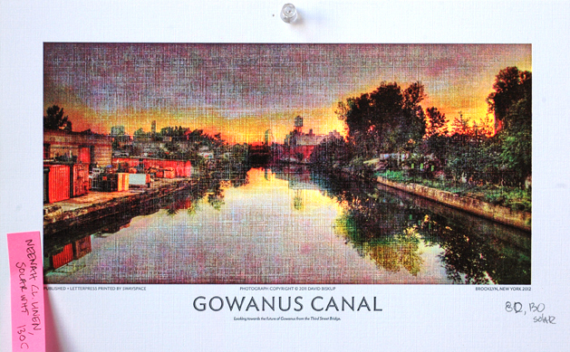
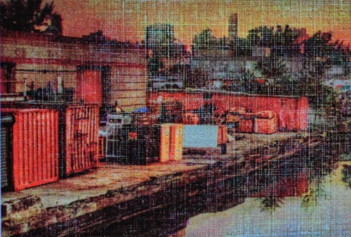
Neenah detail 01
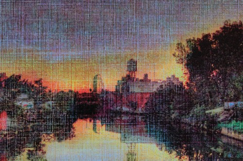
Neenah detail 02
GMUND EVER, Amori, 111# C
The GMUND Ever has what can only be described as a reptilian finish. The detail shots are totally lovely, but unfortunately, their quality doesn't translate when looking at these prints in real-world scale. Many areas are unreadable, and the sense of reflection in the water is totally lost. We're sure this paper could be used to make a really interesting print of some kind. Just not of this kind.
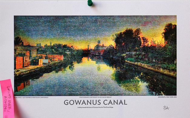
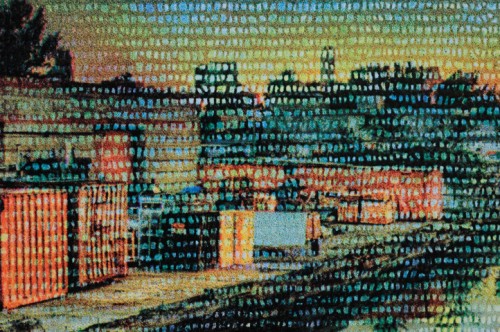
GMUND detail 01
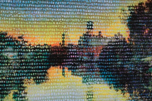
GMUND detail 02
THE WINNER
REVERE SILK, 300 gsm
This paper walks a good line between slick and knobbly. It's smooth enough to hold the detail of a photograph, and soulful enough to give the print a special, tactile quality.
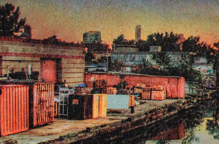
Revere Silk detail 01
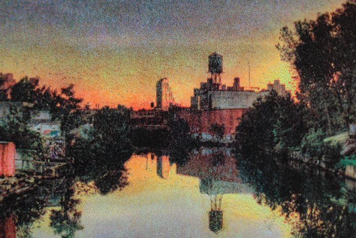
Revere Silk detail 02
We were ready to do a second print. We selected this image, manipulating the digital files to ensure that we'd get a nice clear sky and sharp detail.
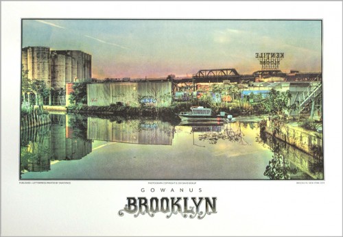
Shannon Miwa, our resident letterer, hand-drew the caption, which is printed in four colors
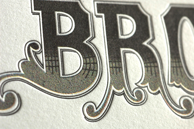
We're pretty happy with the tension between the photographic and the painterly in this print, and the way it manages to celebrate the confluence of the dirty and the dignified.
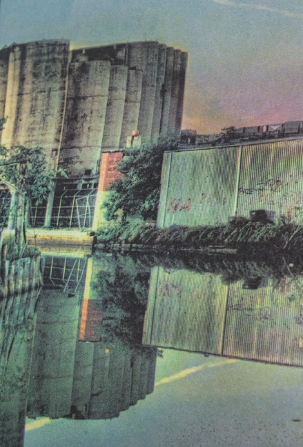
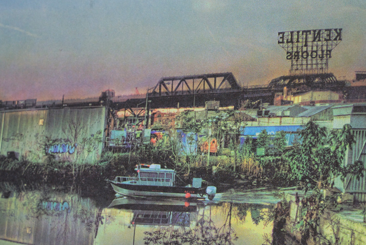
Although not yet available for purchase, one print will be available through silent auction this Saturday, June 15th at the Gowanus Challenge, a historic boat race between the Gowanus Dredgers and the Red Hook Boaters on your favorite radioactive canal!
Dapper Dads
Towards the end of last year, the studio was all abuzz about textiles and patterns. The qualities of fabric, yarn, and lace seemed to hold limitless possibilities for reinterpration through the textural medium of letterpress printing. We followed our curiosity, and came up with our holiday-sweater-inspired Holiday cards. We followed up with a variation on a theme for our Mother’s Day cards.
Our latest card, the Father’s Day Dapper Dad cards celebrating all the dashing and debonair fathers in our lives, represents our most recent iteration.
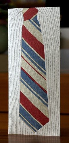
After some experimentation with the scanner, the camera, and some hand-drawn sketch work, we bid to stay away from the linearity of some vector illustrations by tracing a real shirt and tie, emphasizing the ticking in the shirt, the herringbone weave in the tie and the ebbs and flows of the contrasting patterns.
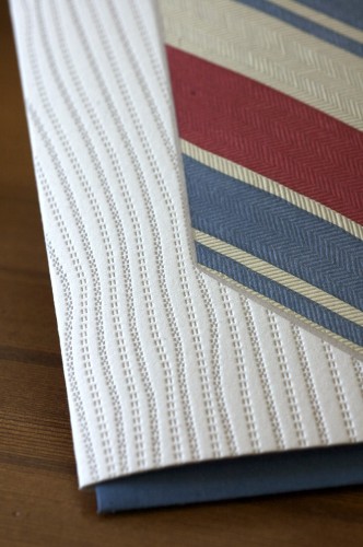
We printed the three colors that form the stripes of the tie first. We put in extra packing for the final plate, impressing deeply into the paper in order to mimic the textural qualities of the fabric itself. For the ghosted tie image on the back of the card, we made a conscious decision to minimize the punch– we wanted to leave your writing surface as smooth and well-groomed as the dad you adore.
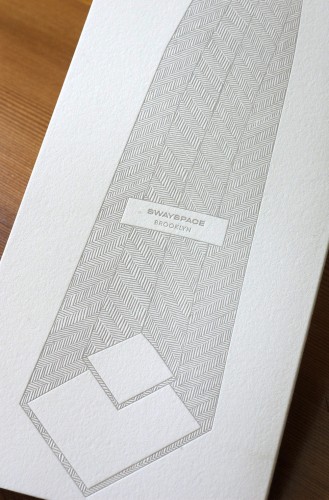
You can order your Dapper Dad cards through our online store, or pick them up at Lion In the Sun in Park Slope, By Brooklyn in Carroll Gardens, and Sparrow Hair in Chicago.
Happy Father's Day, dapper dads.
Declassified: the Great Gowanus Letterpress Paper and Ink Challenge, Part I
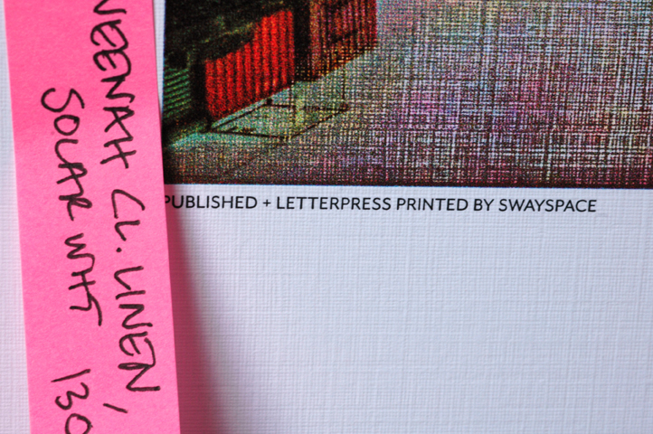
In our original translation of David Biskup's photograph of the Gowanus Canal (see our
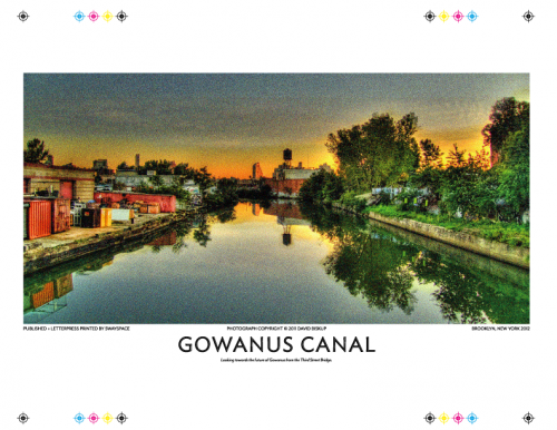
The original digital file
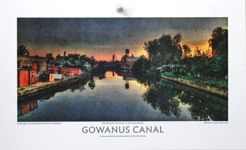
Letterpress print on Mohawk Superfine 260# DTC
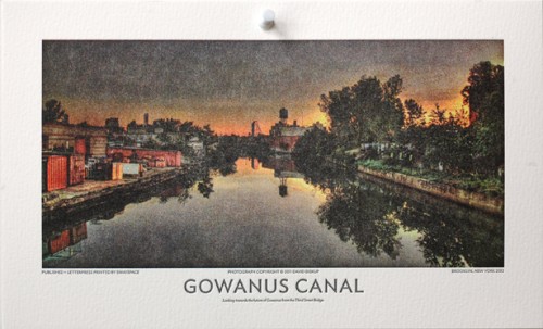
- Letterpress print on Hahnemühle Copperplate Bright White 600 gsm
The Mohawk Superfine's smooth, hard, commercial surface and Copperplate's softer, toothier aspect accounted for the some of the variability of how the ink lay down. The physical composition of the inks was another factor. We began to wonder: if we had a panoply of papers at our disposal– representing a diversity of surface textures, weights and densities– would we get any closer to a perfect print? But then how might we prevent the muddying of the inks?
Someone pointed to the ink shelf.
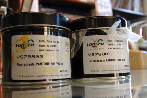
That's right, fluorescents. The Great Gowanus Letterpress Paper and Ink Challenge was on its marks.
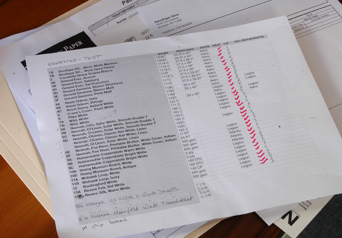
We gathered samples exotic and mundane: from Canaletta Grana Grossa to Neenah Blotter, from the elegant Revere Silk to the schmarmy Plike. All are equal under the blade of the guillotine. Once chopped and stacked according to weight, each sheet was run through the press; incremental packing was added as the sheets got thinner.
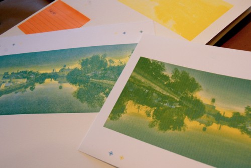
Working to match the letterpress to the digital print

Making note of printing variations...
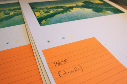
... and logging opinions
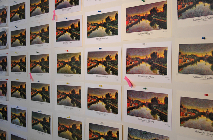
Great Wall of Print
Having flagged the most promising– or at least the most interesting– we've begun the process of evaluating the results. Stay tuned for Part II, where we reveal some of our findings. Let the anticipation be sweet torture.
WalkaboutNYC Studio Tour at Swayspace!
We're looking forward to hosting you on Friday, October 19th during WalkaboutNYC, the annual self-guided tour of some of New York City's most creative agencies.
We'll be opening our doors to the public from 4-5, and from 5-6pm. The tour is open to all, and it's free to attend, but space is limited, so don't forget to RSVP.
We'll be inking up the SP20 cylinder press, as well as the C&P 10 x 15 treadle-powered clamshell. Come watch us translate David Biskup's gorgeous photograph of the Gowanus canal into a 4-color letterpress print; we will be giving away copies to all WalkaboutNYC visitors!

And add to that a 1-color set of holiday coasters, based on a charcoal drawing of a snowflake created in-house.

We would love to see you there! Call us at 718-596-3520 with any questions, or shoot us an email at studio@swayspace.com. More information about the tour can be found here.


